A full marketing site redesign for a research-first CRE brand.
- Role
- Lead UX & UI Designer
- Industry
- Commercial Real Estate
- Year
- 2025
- Agency
- GRAYBOX
Impact
Built shared understanding through collaborative discovery
Created new marketing site designs + a scalable design library
Helped users find and engage with valuable market insights
Process
Brand Exploration to Product-Led Thinking
Phase 01Contextual & Foundational Approach
↓
Contextual & Foundational Approach
- Discovery Workshop: Audience
- Role-Based Persona Creation
- Discovery Workshop: Brand
- Moodboard Creation
- Information Architecture: New Sitemap
Contextual & Foundational Approach
- Discovery Workshop: Audience
- Role-Based Persona Creation
- Discovery Workshop: Brand
- Moodboard Creation
- Information Architecture: New Sitemap
Phase 02Strategic Design: Marketing Website
↓
Strategic Design: Marketing Website
- Home Page Design, two strategic directions
- Design Library Creation
- Supporting Page Designs
Strategic Design: Marketing Website
- Home Page Design, two strategic directions
- Design Library Creation
- Supporting Page Designs
Phase 03Strategic Design: Product Experience
↓
Strategic Design: Product Experience
- Knowledge Hub design, consolidating support documentation for platform users
Strategic Design: Product Experience
- Knowledge Hub design, consolidating support documentation for platform users
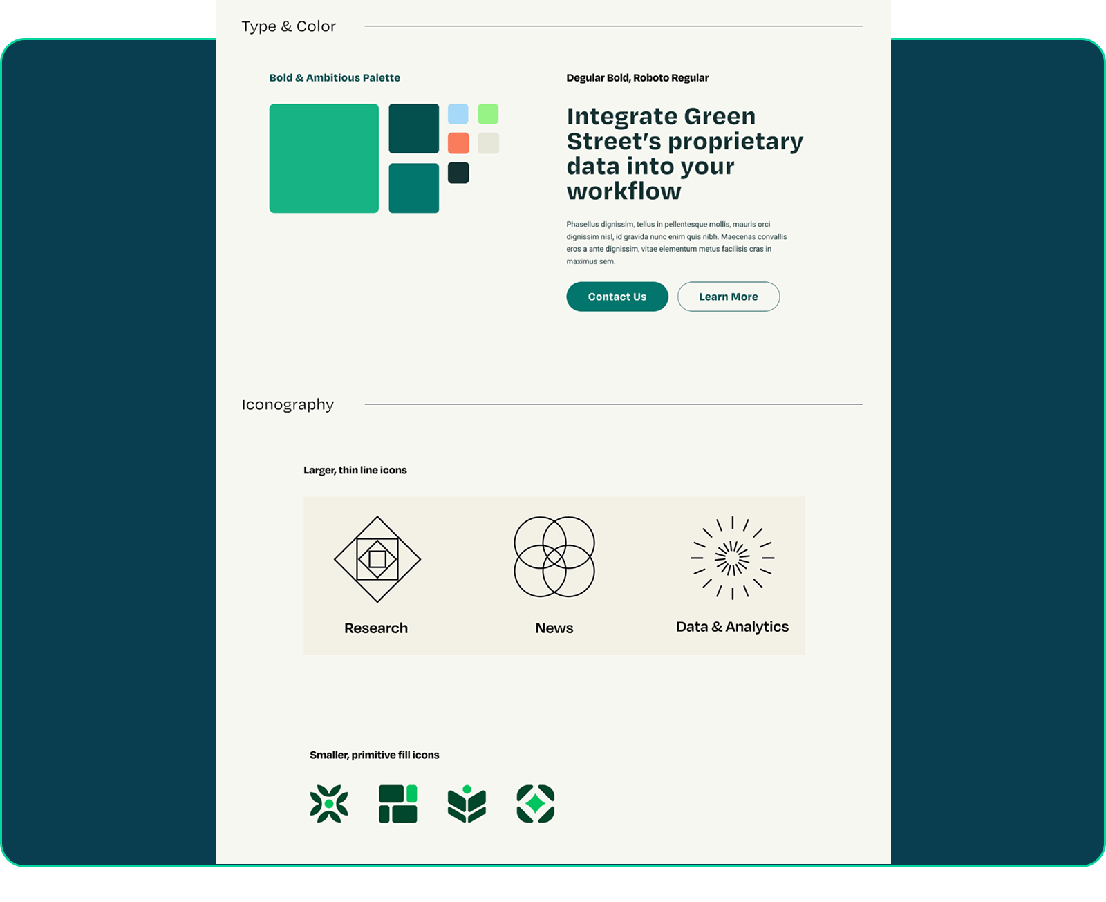
Stakeholder Alignment with Discovery Workshops
We explored audience insights and brand vision in a series of stakeholder workshops. Using what we learned in the brand vision workshop, we created a moodboard defining the site’s visual direction. Assets from the final moodboard were used to create a scalable, comprehensive design library of tokens, icons and components.

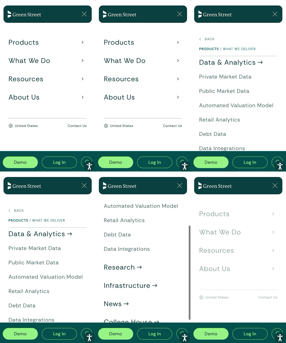
Information Architecture & User-Friendly Navigation
Using insights from an Audience Discovery Workshop, we created role-based personas that informed a brand new sitemap. Using the new sitemap and approved UI direction, we created a new intuitive navigation design that included flows for both potential and current product users.

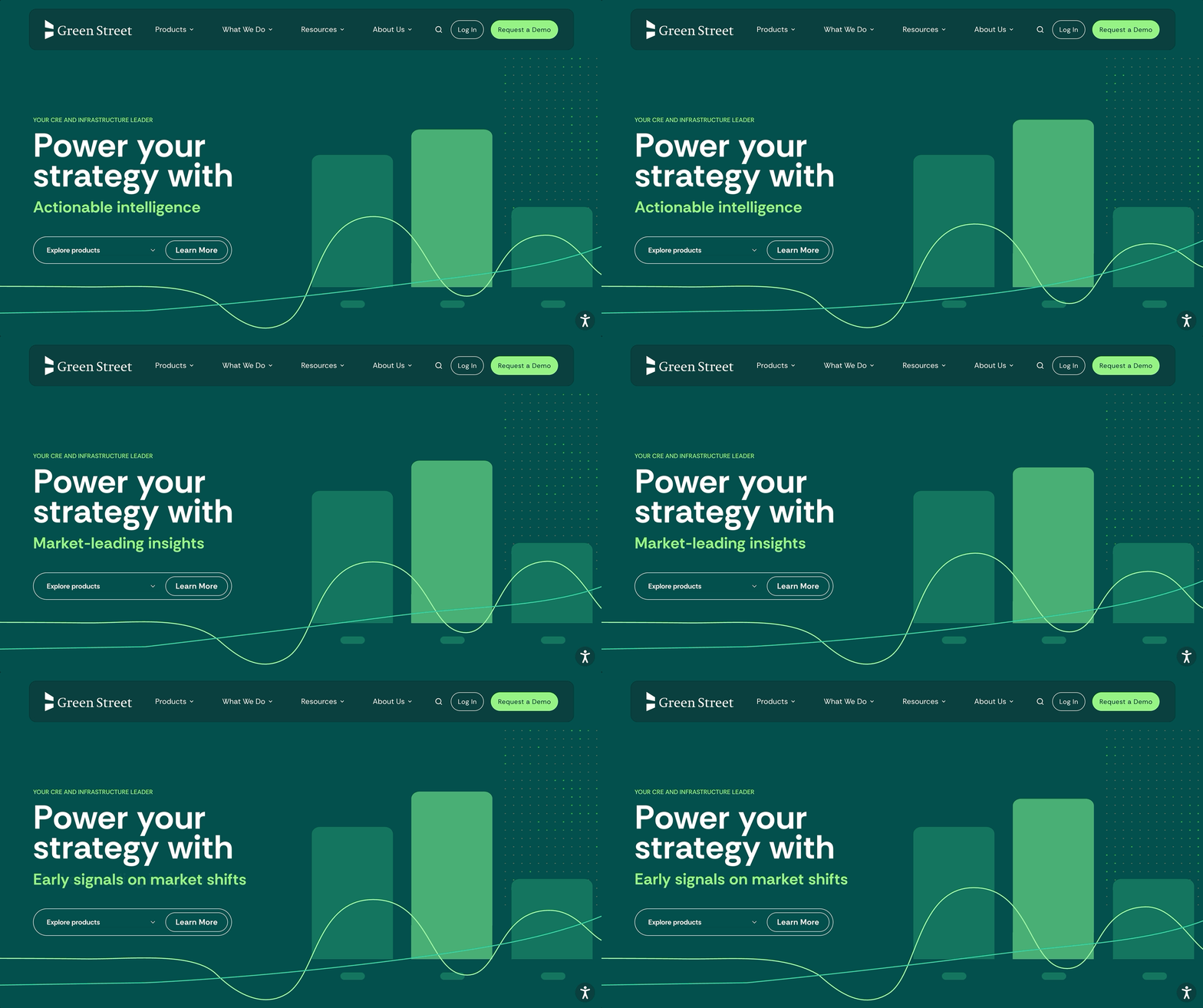
Two Strategic Homepage Directions
After reaching consensus on the site’s look & feel , we created two mid-fidelity prototypes of the homepage that each took a different strategic approach. The final homepage hero (currently live) features an interactive drop-down menu of key products alongside an animated graphic representing the platform’s data and subsequent revenue growth.
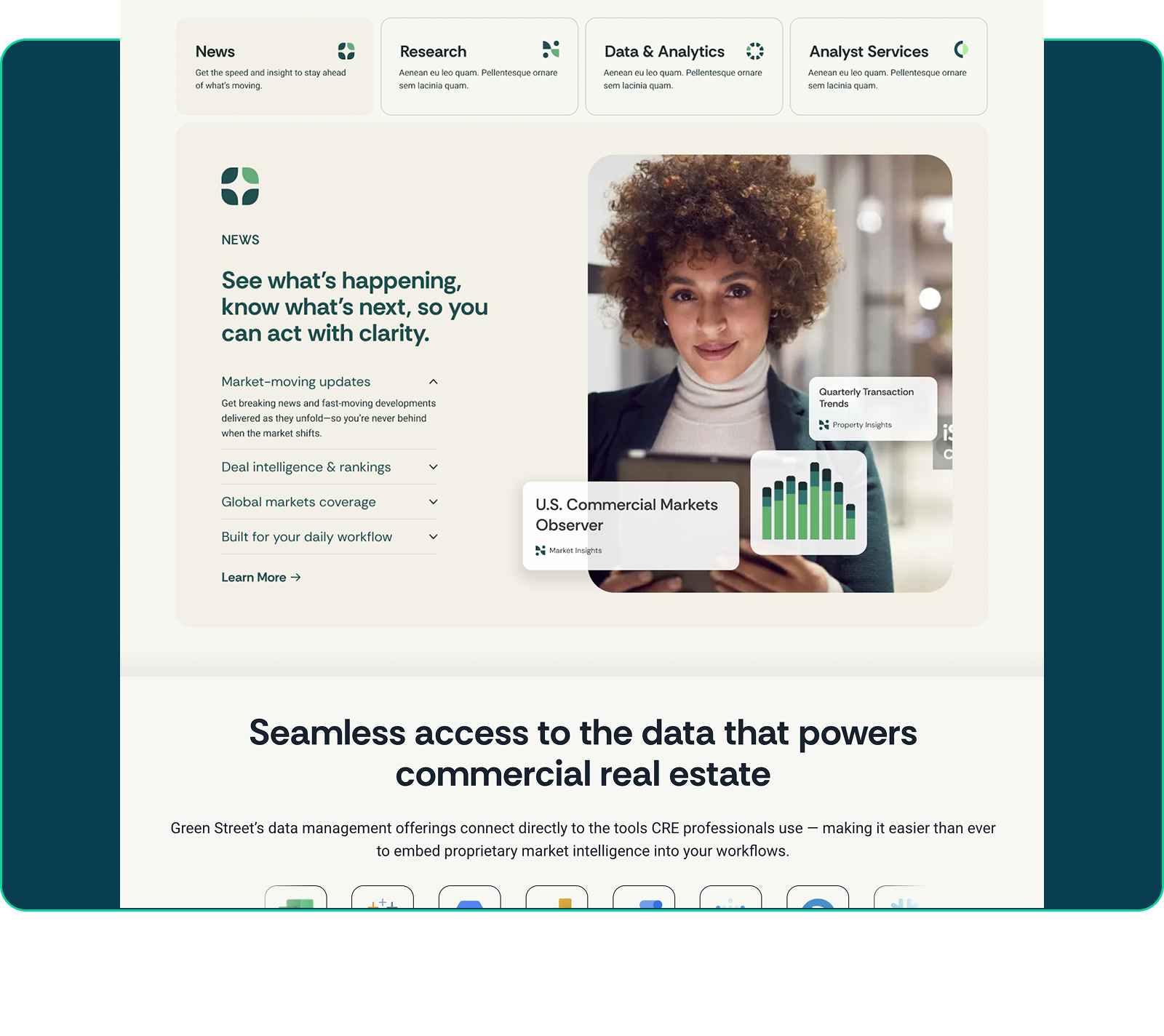
Highlighting Key Product Offerings
Directly below the fold, I designed a padlet system with detailed callouts about each key offering that feature custom graphics demonstrating actions taken within the product experience. This module was intended to convey a clear, overarching narrative about Green Street’s product offerings — something that was missing from their previous homepage.
Systemizing Assets & Scaling
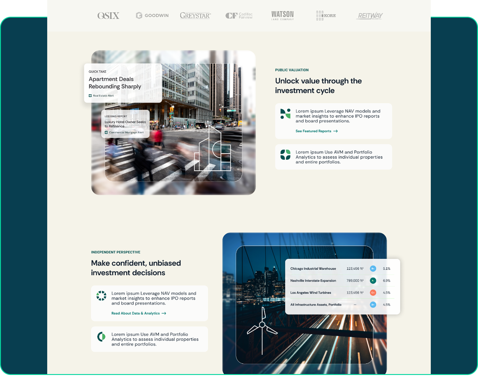
Once our homepage direction was set, we strategically built out additional key site components that were incorporated into our existing design library and used in supporting page designs. Visual assets like these layered product action graphics were created to strengthen the story told on each page, relating it all back to product functionality.
Product-Led Pivot
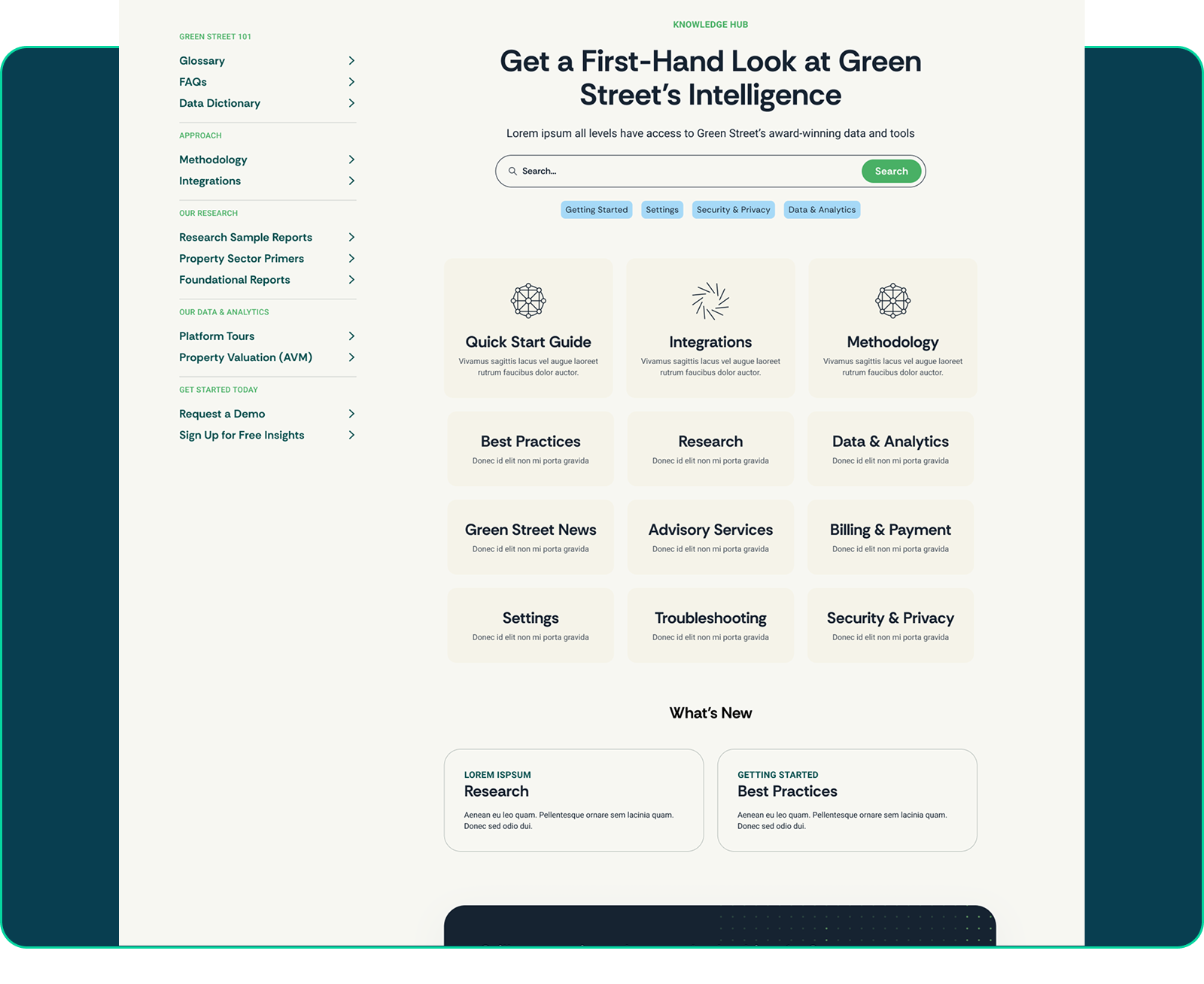
Once the marketing site launched, we shifted our focus from acquisition to existing users with the creation of a central place for all support-related content. This page includes a search bar, a flexible system of category padlets, and a sidebar with nested sub-categories linking users to larger support docs. This page is currently in development.